
Using panelsets
Add tabbed sections to your posts.
Add tabbed sections to your posts.
Grid is the very first CSS module created specifically to solve the layout problems we’ve all been hacking our way around for as long as we’ve been making websites.
Grid is the very first CSS module created specifically to solve the layout problems we’ve all been hacking our way around for as long as we’ve been making websites.
testing the excerpt field
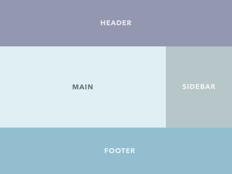
Grid is the very first CSS module created specifically to solve the layout problems we’ve all been hacking our way around for as long as we’ve been making websites.